Organic Suku - Brand + Packaging
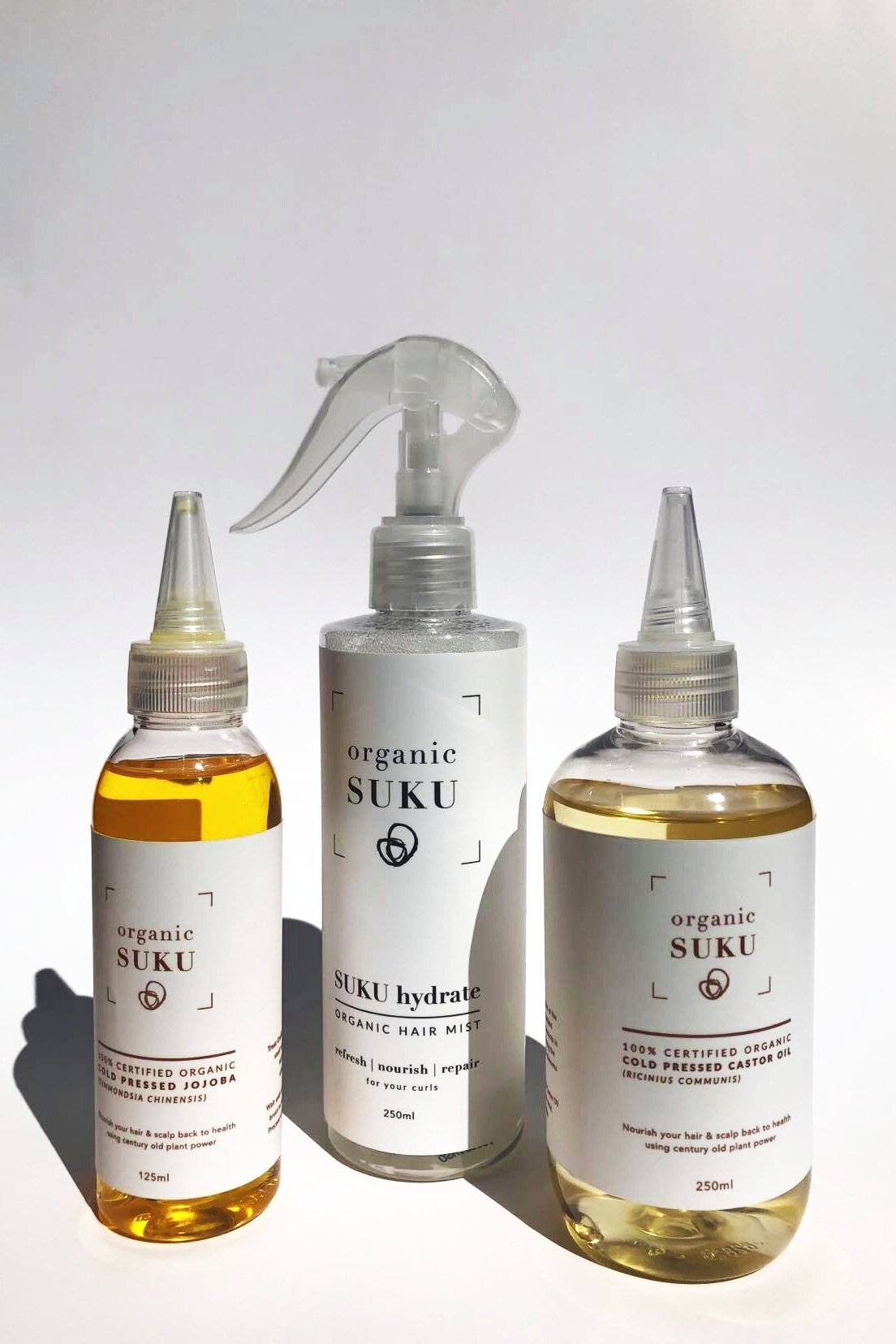
Branding and packaging design for Organic SUKU Hair Care products

Organic Suku
Branding and packaging for Organic Suku hair care products

The hairline


I began working with Lani in 2011 to create a brand identity for her startup Phro Group, a hair care guidance concept she had created. Through her hair care blog she thoughtfully and thoroughly provided hair advice and tips for women with curly, textured hair. I wanted to help her visually encompass her amazing ideas and bring to life this hair care guru. I created her brand identity, values, style guide and product packaging that, much like hair, has grown and evolved over the years.
It all started with a simple hairline.
Lani grew Phro Group in response to the hair care challenges she had recognised. Continuing her vision, she embarked on journey to develop specific solutions to those challenges in the form of a range of boutique luxury, organic products dedicated to nurturing healthy hair and scalp care.
From root to tip - Phro Group to Organic SUKU
Aphro Comb was both her first product and my first product packaging design - an exciting start that would eventuate to a much larger range. I worked closely with Lani from her first product under Phro Group, to redesigning and rebranding her most recent product range as Organic SUKU.
I worked with her to help her create a fresh look and feel against competitor products that were available in this area.
The idea was to create a natural and organic feel that would pay homage to the natural ingredients found in the products. The result is a minimalist design style that begins with the rebrand of her identity to the packaging and labels, presenting a strong brand against the busyness of other products available in this market.
